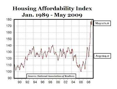
Housing Affordabilty Index: 7.2 Point Drop in May From Rising Home Prices: Market Reached Bottom?
Professor Mark J. Perry's Blog for Economics and Finance

Number of bank failures this year so far: 45 (FDIC data here, click on "Produce Report").
The general improvement in global financial conditions since March has fostered a marked improvement in investor sentiment and led many to inquire when (rather than if) the current U.S. recession will end. Increasingly, market commentary has focused on evidence of “green shoots” that would suggest the rate of economic deterioration is at least slowing. But how can we know that the right signals are being captured, and—more important—how accurate have such measures been in identifying the turning points of past business cycles?

Figure 2 below (click to enlarge) illustrates that after bottoming in November 2008, the index turned positive in February 2009 and continued that trend into March and April. This sharp reversal brings the index to levels that were associated with past economic recoveries. Indeed, by the end of May, the index was near the highs reached following the deep recessions of the mid-1970s and early 1980s. Based on historical patterns, the index’s climb suggests a high statistical probability that a U.S. recovery will begin by the end of 2009.
 MP: Based on the pattern of this index over the last eight recessions, and especially in the four severe recessions of the 1970s and early 1980s, it looks very likely that the current recession might already be over, or will be ending shortly.
HT: Heather Brooks
MyFarm was started by Trevor Paque, a young mortgage broker, who decided in 2007 to get out of the office and take up farming. Hardly a new idea, but Paque took a new approach. His business plan called for building, planting, and harvesting vegetable gardens in small overgrown, weed-infested patches of soil that many people in San Francisco call back yards.
Over the years, the feminist fictions have made their way into public policy. They travel from the women's-studies textbooks to women's advocacy groups and then into news stories. Soon after, they are cited by concerned political leaders. President Obama recently issued an executive order establishing a White House Council on Women and Girls. As he explained, "The purpose of this council is to ensure that American women and girls are treated fairly in all matters of public policy." He and Congress are also poised to use the celebrated Title IX gender-equity law to counter discrimination not only in college athletics but also in college math and science programs, where, it is alleged, women face a "chilly climate."

 Sorry for the light posting over the last few days - I've been on a road trip since Saturday, and for the last 24 hours or so many of the Blogger blogs have been unable to accept new posts (it's still not fixed yet, I found a way around it). And I'm now staying at a Trappist monastery in Iowa for a few days (with no Internet access), before driving up to Minneapolis tomorrow to see Dr. John and the Lower 911 Band at the Dakota Jazz Club. I'll be spending the month of July blogging from my hometown of Minneapolis ("returning to my native village," as they say in India).
My first stop was Cedar Rapids, Iowa, where I lived for part of my grade school days, from kindergarten through 6th grade, and I toured the flood area on Sunday, and I was surprised at how devastated the area still looks one year later. The vast majority of the 4,000 homes that were affected are still abandoned, and will probably never get rebuilt (too old, too damaged, too expensive to rehab, no insurance, etc.). Scattered among those abandoned homes are a few that have been rebuilt with residents living there, and a few that are under construction. But it really looks pretty grim in "Iowa's Katrina" neighborhood.
A few visible signs of how badly the area was devastated, besides all of the abandoned homes:
1. There are portable toilets scattered around the worst-hit neighborhoods, I assume for workers, displaced residents, inspectors, etc. in those neighborhoods, many of which must not have water or sewer.
2. The gas station above in the photos, which was under water on June 13, 2008 at the height of the flood. A year later, nothing has changed, including the year-old price on the sign: $3.87 per gallon.
Here's a recent NPR report "Cedar Rapids, Iowa, 1 Year After Record Flood"
The problem with socialism is that eventually you run out of other people's money.
 It's well known that for the SAT mathematics test, a) male high school students in the U.S. have higher scores on average than females, b) the gap is large and statistically significant (+30 points), and c) the male-female math test score gap has persisted over time, since at least 1971, and probably much longer (see chart above, data here from the Dept. of Education).
 According to the reasoning above, as the number of females taking the SAT exam increased over time (along with the percent of total) relative to males, the mean female score should have decreased relative to the male mean score, and the male-female gap should be INCREASING over time, theoretically.
 Source: Fraser Institute
News from 1930: A daily summary based upon news from the Wall Street Journal from the corresponding day in 1930.
 NEW YORK, June 26 (Reuters) - A gauge of future U.S.economic growth rose, and its yearly growth rate turned positive, raising hopes that the end of the recession is insight, a research group said today. The Economic Cycle Research Institute, a New York-based independent forecasting group, said its Weekly Leading Index (WLI) rose to a 37-week high of 117.6 for the week ending June 19, from a downwardly revised 117.0 the previous week.
 The CBOE Volatility Index (VIX) closed yesterday (Thursday) below 27 for the first time since September 12 of last year, and reached a new 9-month low of 26.36. From the November highs that peaked at almost 81, the VIX has fallen by more than 67%.

 LA TIMES -- Confidence among U.S. consumers rose this month for a fourth straight time, reflecting signs that the worst of the recession has passed. The Reuters/University of Michigan final index of consumer sentiment gained to 70.8, the highest level since February 2008, from 68.7 in May.


 LOS ANGELES (June 25) – Home sales increased 35.2% in May in California compared with the same period a year ago, while the median price of an existing home declined 30.4%, the CALIFORNIA ASSOCIATION OF REALTORS (C.A.R.) reported (see chart above).
“The statewide median price rose for the third consecutive month in May, posting the largest monthly increase on record for the month of May, according to statistics dating back to 1979,” said C.A.R. Chief Economist Leslie Appleton-Young. “Nearly all regions in the state reported positive month-to-month changes in median price."
C.A.R.’s Unsold Inventory Index for existing, single-family detached homes in May 2009 was 4.2 months, compared with 8.7 months for the same period a year ago (see chart above). The index indicates the number of months needed to deplete the supply of homes on the market at the current sales rate.
WALL STREET JOURNAL -- California's median price for an existing single-family house rose for the third straight month, a sign that the state's battered real-estate market may be bottoming out.
California's real-estate market, the nation's largest, is seen as a barometer of the U.S. economy. Housing prices soared during the boom, and their plummet during the market's collapse resulted in massive foreclosures and fueled the recession. Economists say the state's housing market will lag behind the nation's in recovering, so any indication of improvement in California bodes well for the rest of the U.S.
MP: Unit sales increasing in CA + Median home prices increasing in CA + Median number of days to sell a home decreasing in CA + Unsold inventory index (4.2 months) falling to less than 50% compared to a year ago (8.7 months) in CA + Fewer foreclosed properties among those being sold in CA =
REAL ESTATE MARKET IN RECOVERY


From 1980, when Milton Friedman appeared on The Phil Donahue Show to promote his new book "Free to Choose," and discussed topics that are still as relevant and current today as they were almost 30 years ago: deficit spending, regulation, Adam Smith, General Motors, bailing out Chrysler, monetary policy, airline mergers, auto safety, windfall profits tax, automobile dealers, subsidies, smoking laws, legalization of marijuana, monopoly, military spending, energy policy, etc.
HT: Peter Parlapiano


A group of wealthy pensioners has been accused of kidnapping and torturing a financial adviser who lost about $4 million of their savings.
President Obama objects when people use the word "rationing" in regards to government-run health care. But rationing is inevitable if we simply expand government control without fixing the way health care is reimbursed so that doctors and patients become sensitive to issues of price and quality.
There's no brand loyalty that the offer of a "penny off" can't overcome it.
LOS ANGELES, CA - Preliminary results of the latest National Retail Security Survey show that retail shrinkage averaged 1.52% of retail sales in 2008, up from 1.44% in 2007. According to the survey, total retail losses increased last year to $36.5 billion, up from $34.8 billion in 2007. According to the survey, the majority of retail shrinkage last year was due to employee theft, at $15.9 billion, which represented almost half of losses (44%).
"While the economy plays a role in the amount of shoplifting around the country, these crimes are mostly the case of greed instead of need," said National Retail Federation's Joe LaRocca. "People aren't stealing to feed their families; they're stealing iPods, handbags, and other discretionary items."
MP: We hear a lot about corporate greed (526,000 Google hits), but don't hear very much about consumer greed (27,300 Google hits), and even less about employee greed (only 1,990 Google hits). But as the story above highlights, many consumers and employees are quite greedy themselves, and they helped themselves to more than $36 billion worth of merchandise owned by the corporations that are so often accused of being "greedy," (or whose managers are accused of "greed").
Even the majority of consumers who don't shoplift, can still in fact be pretty ruthless, cutthroat and disloyal, read about it here.
ASSOCIATED PRESS -- The recession steered a new type of customer to Wal-Mart - deeper in the pockets and suddenly looking for bargains. Now the world's largest retailer has to figure out how to keep that customer when the economy recovers.
MP: Consumer sovereignty.
WASHINGTON -- The Spanish professor is puzzled. Why, Gabriel Calzada wonders, is the U.S. president recommending that America emulate the Spanish model for creating "green jobs" in "alternative energy" even though Spain's unemployment rate is 18.1%-- more than double the European Union average -- partly because of spending on such jobs?
Even if the "stimulus" package doesn't seem to be doing much to stimulate the economy, it is certainly stimulating many potential recipients of government money to start lining up at the trough. All you need is something that sounds like a "good thing" and the ability to sell the idea.
 The 2008 SAT Math scores (see table above, click to enlarge) reveal statistically significant ethnic differences. Difference-of-means tests (not reported here) reveal that Asians score significantly higher on average than Whites, who score significantly higher on average than American Indians, who score significantly higher on average than Mexicans, who score significantly higher than other Hispanics, who score significantly higher than Puerto Ricans, who score significantly higher than Blacks/African Americans. All differences are statistically significant at the 1% level.
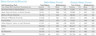 In many cases, the ethnic differences on the SAT math exam outweigh the gender differences. For example, Asian females score significantly higher on average than males of any other ethnic group, white females score significantly higher than males of any ethnic group except Asians, American Indian females score significantly higher than black or Puerto Rican males, and females from all ethnic groups except black/African-American score significantly higher than black males. All significant levels are 1%.
 Greg Mankiw features the chart above on physicians' salaries in the U.S. vs. various European countries and Canada, showing that MDs in the U.S. make about $200,000, which is between 2 and 5 times as much as doctors make in other countries. How do we explain the significantly higher physician salaries in the U.S.?
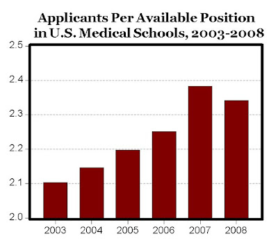
 Because of the 21% increase in applicants since 2003 for only 9% more openings available in U.S. medical schools, the number of medical school applicants per available opening in medical schools increased from 2.1 in 2003 to 2.34 in 2008 (see chart below).
 Because of the significant increase in applicants for a much smaller increase in available openings in medical school, the percent of medical school applicants accepted has decreased from 47.5% in 2003 to 42% in 2007, before increasing to 42.7% in 2008, see chart below.
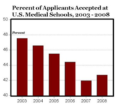 Bottom Line: One reason we might have a "health care crisis" due to rising medical costs, and the world's highest physician salaries is that we turn away 57.3% of the applicants to medical schools. What we have is a form of a "medical cartel,: which significantly restricts the supply of physicians, and thereby gives its members monopoly power to charge above-market prices for their services.
 Falling Intrade odds for Bernanke's reappointment as Fed chair, from 75% to 60% in 17 days:


 On a previous post, I documented the statistically significant male-female test score gap for the 2008 SAT math exam, and the graph above shows that this statistically significant difference of more than 30 points has persisted over time. Could the male-female SAT math test score gap be explained by: a) males taking more math classes than females in high school, or b) males demonstrating higher performance in high school math classes than females, or c) male high school students having higher GPAs than female students? The answers appear to be NO, using data from the 2008 SAT report.
Table 14 below (click to enlarge) shows that there is essentially no male-female difference for average years of math study (3.9 years for males vs. 3.8 years for females) or math GPA (3.12 for both male and female students).
 Table 15 below (click to enlarge) shows no male-female differences for: a) years of math study or b) highest level of math achieved, and shows that the 54% of students taking AP/Honors math classes are female vs. 46% male. That is, there are 117 female students taking AP/Honors math classes for every 100 male students.
 Bottom Line: Female high school students are better students on average compared to male high school students, and they are equally or better prepared than males for the math SAT exam based on the number and level of math classes taken in high school. And yet, male students score significantly higher on the SAT math test than females, and the statistically significant male-female test score gap of more than 30 points persists over time.
 The table above (click to enlarge) shows mean test scores and standard deviations for the SAT exam on the three different sections (reading, math and writing), broken down by gender (data available here, see Table 2) for the more than 1.5 million college-bound seniors who took the SAT in 2008.
 The difference between male and female test scores for the math section of the SAT has persisted over time, see chart below (data here, page 3).
 Although the gap between male and female test scores has declined over time, and in 2008 was the smallest (33 points) since 1971 (see chart below). However, given the large sample size, even a difference in mean test scores of one point would still be statistically significant, so the gap would almost have to completely disappear before the average male and female scores would be statistically equivalent.
 Between 1998 and 2008, the percentage of college-bound high school seniors with a GPA equal to letter grades of A+, A or A- increased from 38% to 42%, while the average SAT scores for that group decreased by 15 points from 565 to 550 for the Reading section, and by 19 points from 578 to 569 for the Math section (data here from The College Board, Table 17).
 WASHINGTON (Dow Jones) -- Existing-home sales improved again in May, but falling prices and bloated supply promise to make a housing sector recovery slow.
Great economic data and free services are available from the National Bureau of Economic Research, where you can register to receive free e-mail notifications of more than 100 different economic releases. You can also access all of the hundreds of current and archived economic reports, and view the release schedule for each report.
 Manufacturing activity in the central Atlantic region advanced somewhat faster in June, according to the Richmond Fed’s latest survey. The seasonally adjusted manufacturing index — our broadest measure of manufacturing activity — jumped to 6 from May’s reading of 4 (see chart above). Looking at the main components of activity, new orders expanded further, while factory shipments grew at a slightly slower rate and employment exhibited more moderate weakness. Other indicators were mostly positive. Backlogs increased for the first time since August 2007, while vendor delivery times stabilized and capacity utilization edged higher. In addition, manufacturers reported somewhat quicker growth in finished goods inventories.
 NEW YORK, June 19 (Reuters) - A gauge of future U.S. economic growth rose along with its yearly growth rate, reaffirming hope that yearly growth will turn positive in the summer months, a research group said on Friday. The Economic Cycle Research Institute, a New York-based independent forecasting group, said its Weekly Leading Index (WLI) rose to a 36-week high of 117.1 for the week ending June 12, from an upwardly revised 116.2 the previous week (see chart above). In recent weeks, the group has forecast that the U.S. recession will end sometime during this summer, as its yearly economic growth reading rebounds from late-2008 lows.
"With WLI annualized growth rocketing up almost 30 percentage points in six months (MP: from -28.1% in December), it's virtually pounding the table about the recession ending this summer," said Lakshman Achuthan, managing director at ECRI.
Canada's oil sands hold an estimated 170 billion barrels of oil that can be recovered with existing technology and as much as 1.7 trillion barrels -- more than five times the size of Saudi Arabia's reserves -- that could be produced with the use of new methods that are being developed.