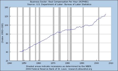
Real Hourly Compensation Has Increased
 We hear a lot about stagnant or declining real incomes, but the graph above shows the relentless and continual increase in real hourly compensation since 1947, data are from the BLS, see the most recent release here. One issue is that compensation includes both wages AND benefits, and we should really look at TOTAL COMPENSATION over time, and not just monetary wages.
1. The data in the graph above are quarterly, and measure real (inflation-adjusted) hourly compensation (wages AND benefits). Click on graph to enlarge.
2. Using the percent change from the same quarter a year ago, real wages increased by 3.3% in the third quarter this year, 3.7% in the second quarter this year, and 2.6% in the first quarter of this year. In fact, we have had 45 consecutive quarterly increases in real compensation, and you have to go all the way back to the second quarter in 1995 for the last quarterly decrease in real hourly compensation.
3. The last time in U.S. history when there was a consectutive increase that long in real hourly compensation was from 1961-1973, when there were 51 staight quarters of increases in realy hourly compensation.
4. Over the last 10 years, there was a 25% increase in real hourly compensation for the first time for a 25% increase in real compensation during a 10-year period since the 1963-1973 period.
Don't buy into all of the "gloom and doom" scenarios about declining incomes - real hourly compensation is at an all-time high, and has increased faster over the last ten years than in a generation.

7 Comments:
So what?
There are two questionable aspects about this graph. As I think Rusty was pointing out, there is no breakdowns by income level. Big increases for a handful of people on the top end of the income scale can pull up the average for everyone.
Also, how are the value of benefits calculated? If the cost of my insurance has increased by 500% and my company only paid for half of that increase, does that mean my "total compensation" (my salary plus what my company is paying towards my insurance) has gone up even though my take-home pay (my buying power) has decreased? Health benefit costs have increased MUCH faster than inflation.
Comments above are right; average 'hourly' wage is skewed by folks pulling down $1M or more.
From the linked report it appears that manufacturing wages continue their nosedive.
Also, 'real' wages contain a false & fatal assumption: the cost of living is not constant. In 1947 it was possible for Mr Middle Class to actually pay for most medical care on his own. He could buy (or build!) his own house on a 5-year mortgage, and considered that outrageous; he made sure to pay it off sooner. He didn't spend 3 hours a day burning gas.
Okay, so is this averaged or per capita? If averaged, it most likely masks the accelerating redistribution of wealth upward.
With the cost of health care having skyrocketed during the period you charted, it's no wonder that you could come to the conclusion that "hourly compensation has increased". Only a greater and greater share of that compensation goes to pay for the same services which only comprised a small part of your compensation package before.
So in fact your "increasing compensation" isn't keeping pace with the increasing cost of things like health care.
The chart is misleading on purpose. The government has repeatedly revised the CPI taking out food, housing, transportation and medical costs which is incredible considering that everyone needs food, a place to live, a way to get to work and to see the doctor from time to time. Yes, the price of TVs, radios and alots of other junk we don't need has fallen but the price of what people need has risen.
If you consider the number of hours worked per household to support a median family, it's climbed every year since 1973. Regardless of Democrats or Republicans in office.
All the writers who attempt to explain that it is better today than yesterday are in dreamland.
The middle-class today is experiencing a signifcant loss of disposable income. This is income that one can use as desired. The IRS confirmed this in a document that stated that in 1948 the dependant exemption of 42% of the per capita income, dropping in 1984, to 6.4% , increasing to 11.2% in 1990. To make it the same as it was in 1948 when the middle-class was economically strong, the exemption has to be over $11,000! Think what this means. A family of 4 would pay no taxes on an income of $44,000!!.
Congress over the past 50 years, pressed by special intersts has removed many of the deductions used in previous years to reduce the amount of taxable income.
The result is those who are in the low income brackets pay no income taxes and those in the very high income brackets have disposable income that allow them to 'invest' in areas that provide additional deductions so that the high gross taxable income brackets have a minimal or no taxable income.
A better way is to use the amount of taxable income divided by the gross income. Using this approach one will find that low income brackets have 0 or near 0 % and the same will be true for the high income brackets. This will clearly show that the middle-class is being used by the few!! I believe that is what they used to call a "serfdom"
Post a Comment
<< Home