Friday, August 31, 2012

Pew's Political Party Quiz

Do your views align more with Republicans, Democrats or Independents? Answer 12 questions in a new Pew Research Center quiz to learn where you fit on the political spectrum. Explore how you compare to other Americans by age, gender, race and religion.

Update: If you don't like the Pew quiz, try the World's Smallest Political Quiz.

Friday Afternoon Links

1. Detroit metro area home sales increased 13.2% in July vs. last year, and the median sale price increased 17%.

2. Natural gas spot prices fell this week to $2.64 per million BTUs, the lowest since mid-June more than two months ago.  

3. Rates for 30-year mortgages fell 7 basis points this week to 3.59%.

4. Data Quick: National home sales over the last 30 days increased 9.7% above last year.

5. Real personal consumption expenditures increased 2% in July YoY and reached a new all-time monthly record high of $9.62 billion. The July increase was the 30th consecutive monthly increase in real consumer expenditure on a YOY basis starting in February 2010. 

6. July home sales in San Antonio increased 13% vs. last year, and the median price was up by 4.6%. 

7. Compressed Natural Gas (CNG) Filling Station Opens in Akron, OH Selling CNG at Equivalent Gas Price of $1.95 per Gallon.  

8. New York might not allow fracking in its state, but it sure likes to guzzle down frack-produced natural gas from Pennsylvania and other states.  John Hanger points out that NY's natural gas consumption increased 18.6% in the first half of 2012, and it consumes 10% more than neighboring Pennsylvania, and points out the following hypocrisy:

"New York guzzles gas everyday and supports fracking with its purchases, whether or not it does its part to meet America's energy needs."

9. Another stunning fact from John Hanger: "A seven-well pad in Morris Township has produced 23 billion cubic feet of gas. Of that total, the top producing single well in the Commonwealth has provided 6 billion cubic feet.  A true gusher!

Since the annual, average residential gas consumption in Philadelphia is about 87,000 cubic feet, this prolific well pad has supplied enough gas for 264,000 residential gas accounts in Philadelphia for a full year.  That's more than half of the homes using gas in Philadelphia and is just amazing!"

10. From this week's rail traffic report: Lumber shipments were up 21% last week and are up 12.6% YTD (to supply an increase in new home construction?), oil shipments increased 56% for the week and are up 41% YTD, and motor vehicle shipment were up 7% for the week and are up 20.5% YTD.  

Energy Prosperity: Oil Production in Lower 48 Hits 23-yr. High in July, Oil/Gas Jobs Reach 24-yr. High


Buried in this week’s 213-page August Monthly Energy Review from the EIA (full report here) is the fact that U.S. crude oil production for the lower 48 states is estimated to have reached a 23-year high in July of 5.865 million barrels per day (see top chart above, data here).  If so, that would be the highest monthly production of crude oil in the lower 48 states in more than 23 years, since April of 1989 when 5.88 million daily barrels of oil were produced.  From January-July of this year, the EIA estimates that oil production in the non-Alaska states increased more than 14% compared to the same period last year, boosted by the strong, ongoing gains in North Dakota oil (+66% year-to-date through June 2012 vs. last year) and Texas oil (+35% year-to-date through June compared to 2011).

Thanks to advances in technology (fracking and horizontal drilling), domestic oil production has been increased dramatically since 2010, reversing a quarter-century downward trend in U.S. oil production that started in the mid-1980s.  Over the last year, we’ve seen one of the largest annual increases (17%) in domestic oil production (for the lower 48 states) in the history of monthly EIA oil production data going back to 1973.

 Accompanying the boom in domestic oil and gas production has been a huge boom in “shovel-ready” jobs for that sector (see bottom chart above, data here).  Over just the last two years, employment in the oil and gas industry for drilling-related jobs has increased by more than 23% to 195,500 jobs in July, which is the highest level for those jobs since early 1988, more than 24 years ago.  America’s booming energy sector has been creating an average of 85 new jobs every business day for the last year, and those are just the direct jobs for oil and gas extraction, and doesn’t count all of the indirect jobs created throughout the supply chains for oil and gas.

A recent Bank of America/Merrill Lynch report estimates that the economic benefits to the U.S. economy from the booming domestic energy production, especially from the surging output of unconventional shale gas and oil, are approaching $1 billion per day. With all of the concerns about the sub-par growth of the overall economy during the last three years of recovery (2.2% average real GDP growth since June 2009), imagine what the growth rate of the economy would be if we didn’t have the booming oil and gas industry that is bringing energy prosperity and shovel-ready jobs to states like North Dakota, Texas and Pennsylvania.

Bottom Line: America’s booming energy sector, especially the increased production related to shale oil and gas reflected in the 23-year high for domestic crude production (lower 48 states) and 24-year high for oil and gas jobs, remains America’s “economic bright spot,” and it continues to get better and brighter all the time.

Great Moments in Government Regulation: Thou Shall Not Change Signs More than Twice per Day

1. Washington Post -- "If the Church of the Good Shepherd in Vienna, VA wanted to post the Ten Commandments on its sign on Hunter Mill Road, it would take five days to broadcast them all. That’s because Fairfax County has a commandment of its own: Thou shall not change electronic signs more than twice a day."

"So, after the Vienna United Methodist church posted three messages one day last month — offering refuge from the heat, then promoting its Web site and finally listing the time of a group prayer meeting — a zoning inspector called it a sin and hit the church with a warning letter":

“It is noted that the screens changed more than twice in a twenty-four (24) hour period,” the letter stated. “This changeable copy LED sign is considered a prohibited sign.”

"The county offered two choices: permanently limit the sign to two message changes per day or remove it altogether. At a meeting at the end of July, about two months after the church installed the sign, the county and the congregation couldn’t agree on a compromise. So the church, believing that the First Amendment also applies to the word of God, sued last week in federal court in Alexandria, saying the two-message limit violates the church’s rights to free speech and the free exercise of religion. The suit says that the county’s ordinance violates a 2000 law, the Religious Land Use and Institutionalized Persons Act, which prohibits zoning rules that place undue burdens on religious institutions."

UpdateFairfax County says it will revisit sign rule that sparked church lawsuit

HT: Curtis Purington


Thursday, August 30, 2012

Gas Prices Around the World: Relative to Income, U.S. Has Some of the Cheapest Gas in the World

A few weeks ago Bloomberg featured the "Highest & Cheapest Gas Prices by Country, where they ranked 60 countries by the average retail gas price at the pump and by the "pain at the pump," which is measured by the percentage of average daily income needed to buy a gallon of gas.  Here are some of the findings:

1. Based on both the retail price of gas and "pain at the pump," Venezuela has the cheapest gas in the world at $0.09 cents per gallon, cheaper even than bottled water.  

2. The world's highest retail gas price is found in Norway, where it would cost almost $400 to fill up the 39-gallon tank of a Chevy Suburban at $10.12 per gallon.  Turkey has the second-highest retail gas price at $9.41, followed by Israel at $9.28 and Hong Kong at $8.61.

3. For "pain at the pump," India has the most expensive gas in the world relative to income, even though the retail price there of $5.44 per gallon is about 50% less than the prices in Norway, Turkey and Israel.  

At $5.44, one gallon of gas in India is 1.43 times more expensive than its $3.81 in per-capita daily income, based on annual per-capita nominal GDP of $1,389 according to the IMF for 2011. Filling up a Chevy Suburban in India would be equivalent to about two months of income, based again on per-capita GDP. 

If gas was that expensive in the U.S., it would cost us about $189 per gallon (based on annual per-capita GDP of $48,387).  So even at $3.81 per gallon, gasoline here is a real bargain.  

4. For "pain at the pump," the U.S. ranks No. 55 out of 60 countries in the latest Bloomberg ranking (where No. 1 is the most expensive/painful and No. 60 is the most affordable/least painful).  Relative to our income, Americans have some of the cheapest gas in the world. 

Update: Another way to express the "pain an the pump" concept of the relative cost of gas around the world is to consider the "time cost of gasoline," measured in the number of minutes, hours, or days of work necessary to earn enough income to purchase one gallon of gasoline at the retail price in various countries.  

Using per-capita GDP as an approximation for income, a typical Indian would have to work about 12.5 hours (or more than a day and-a-half) to earn enough income to buy a gallon of gas at $5.44.  In America, the typical worker would have to work less (fewer?) than 10 minutes (9.45 minutes) to purchase a gallon of gas at $3.81.  

Bottom Line: Measured in time, gasoline in the U.S. is almost 80 times cheaper than in India, and for that we should be thankful.  

Shifting Demographics Explain the "Hollowing Out"


In a post earlier this week, I featured a recent Pew Research Center report that presented data on the changing distribution of income in the U.S. between 1971 and 2011.  In 1971, Pew calculated that 25% of U.S. adults were in the “lower income” category, but by 2011 the share of “lower income” Americans had increased to 29% (see chart above).  During that period, the percentage of “middle income” Americans decreased from 61% to 51%, leading Pew to conclude that “The hollowing of the middle -income tier has been a steady and virtually uninterrupted process over the past four decades.”
 
Importantly though, there were very significant demographic changes that took place over that forty year period that could help explain the shifting distribution of income.  For example, consider three groups of Americans that would likely be overrepresented in the “low income” category relative to their share of the U.S. population: a) immigrants, b) older Americans, and c) young Americans in college.  How have those groups changed over time?

1.  In 1970, immigrants accounted for only 4.7% of the U.S. population, but the immigrant share of today’s population is 12.5%.

2. The percentage of Americans aged 65 or older in 1975 was 10.5 percent, but had risen to 13.1 percent by 2011.

3. The number of students enrolled at an institution of higher education increased from 4.2 percent of the total population in 1970 to 6.6 percent of the total population in 2009.

Over the 40-year period between 1971 and 2011, the number of immigrants, older people, and college students have all increased relative to the total population, and those groups would naturally be expected to have lower-than-average incomes.  The changing demographics could therefore help explain Pew’s conclusion that “… from 1971 to 2011, the U.S. adult population has become more economically polarized with relatively more in the top and the bottom tiers, and fewer in the middle.”

Bottom Line: What Pew calls “economic polarization” might alternatively be described simply as changes in demographics over time.  Compared to 1970, we now have more immigrants, more older Americans, and more young Americans in college as a share of the population, and that could help explain the “hollowing out” of the middle class and the increase in Americans with low incomes.  Pew’s rather gloomy conclusion is that the middle class is shrinking and “falling backward in income and wealth.”  But perhaps it’s more the case that shifting demographics and longer life expectancy over the last forty years can explain what is likely just a natural increase in the percentage of Americans classified as “low-income.”

HT: Colin Grabow

Wednesday, August 29, 2012

Baltimore Orioles Practice Market-Based Pricing

Click to enlarge.
The Baltimore Orioles are using a market-based ticket pricing strategy by charging about a  50% premium for tickets to "prime games," which are only those games against the New York Yankees and Boston Red Sox (see pricing chart above, and full ticket schedule here).  

Guess that confirms the economic reality that "face value" isn't the same as "market value," and/or that "face value" increases when demand is high.  Also confirms the reality that if venues and stadiums set ticket prices according to fan demand and market forces, they can reduce or eliminate the secondary market for tickets being sold above face value.  There can only be a secondary market for tickets being sold above face value if the tickets in the primary market are priced below market value.    

For an artist, promoter, venue or sports team to complain about "ticket scalping" in the secondary market is really an admission that the tickets were under-priced and/or under-supplied in the first place in the primary market.  Eliminating "ticket scalping" has always been very simple: raise ticket prices and/or increase the supply of tickets (for concerts).  Looks like the Orioles have finally figured this out by charging higher ticket prices when fan demand is high for Yankees and Red Sox games.  It's basic ECON 101.  

Update: To avoid the controversy about whether the Orioles' differential pricing qualifies as "price discrimination," I refer to it now as "market-based pricing."  The main point is that the Orioles differential ticket pricing demonstrates the economic reality that a ticket's "face value" is often much different (higher or lower) than its true market value.  With a uniform ticket pricing strategy, the Yankees and Red Sox games would frequently sell out, which would then create a secondary market where tickets would sell above face value. By charging a ticket premium for prime games, the Orioles organization can effectively eliminate or reduce "ticket scalping."  It's a step forward in the right direction that a professional sports team demonstrates some understanding of basic economics, and prices some of its tickets according to fan demand.       

Political Nitwitery in Michigan

As I mentioned previously, a Michigan state representative wants to cap ticket prices sold on the secondary market for concerts and sporting events to a legally-mandated maximum of 10% above face value. I've argued before on CD that if the 10% price cap applied to tickets sold in the primary market, it would basically put Ticketmaster out of business, since its fees are often in the 20-25% range.   But that's not Rep. Geiss's target - he's upset about tickets sold on Seat Geek, Stub Hub, eBay, Craigslist, etc. 

In today's Detroit News, I argue that a legally-mandated ticket cap of 10% above face value won't change the underlying market forces that frequently lead to ticket prices selling above face value, and would be an unworkable government price control that would make fans worse off, not better off.  And where do these politicians get the infinite wisdom to know that "10% above face value" is the "correct" or "fair" price, and not 5%, 15% or 30%? 

Markets in Everything: An Ingestible Sensor That Sends Health Information to Your Phone


From Springwise.com: "Just cleared by the FDA late last month, this new ingestible sensor from California-based Proteus Digital Health is about the size of a grain of sand and can be integrated into an inert pill or medicine. Once in the stomach, it is powered solely by contact with stomach fluid and communicates a unique signal that identifies the timing of ingestion. This information is transferred through the user’s body tissue to a battery-operated patch worn on the skin that detects the signal along with physiological and behavioral metrics such as heart rate, body position and activity. That data, in turn, gets relayed by the patch to a mobile application, where it can be made accessible by caregivers and clinicians. The video above explains the premise in more detail."

Private-Sector Real GDP Grew By 3.3% Over the Last Year Through Q2, Equal to Post-1947 Average

Graph, post and title have been updated to reflect the 3.26% average growth rate in private GDP since 1947.


The chart above shows annualized growth rates for: a) quarterly private-sector real GDP, calculated as real total GDP minus real government spending (which would be equal to personal consumption expenditures, gross private domestic investment, and net exports), see blue bars in chart, and b) quarterly public-sector real GDP, which is  "government consumption expenditures and gross investment" (brown bars), from 2000 to 2012.  

Based on the data released today by the BEA, private-sector real GDP increased by 2.31% in the second quarter this year (at an annual rate), following growth of 3.1% in Q1 2012, 5.5% in Q4 2011 and 2.3% in Q3 2011.  Over the last year, private-sector real GDP increased by 3.3%, following 3.1% in the previous year, and both of those growth rates are close to the average growth rate over the last 65 years of 3.26% since 1947 (see updated chart).   

Public-sector real GDP declined by -0.89% in the second quarter of 2012, and by -2.3% over the last year.  Here's how the 2.3% annual decline in public-sector GDP breaks down: Defense spending fell by 4%, non-defense federal spending declined by 2% and state and local spending decreased by 1.6%.  The -2.3% annual decrease in Q2 public-sector GDP is the seventh consecutive quarter of a year-over-year contraction in public-sector GDP, which hasn't happened since the early 1970s. 

As I concluded a month ago following the first estimate of second quarter GDP in a post that generated almost 200 comments:

Maybe it's true that the "private sector is doing fine" and most of the sub-par economic growth measured by real GDP is simply reflecting the decreases in government spending at the federal, state and local levels, and not weakness in the private sector?  In that case, maybe the sub-par recovery has some positive effects of shrinking government?  And why don't more economists, analysts, and reporters calculate and report private- and public-sector economic growth separately? 

Another question: Given the data above, shouldn't more people be happy that the private-sector GDP has been expanding at the historical average rate over the last several years, while at the same time the public-sector GDP has experienced the longest period of contraction in 40 years?

2012: The Year of the Housing Recovery, Part III

More positive housing data:

1. The National Association of Realtors (NAR) reported today that its Pending Home Sales Index (PHSI) rose by 12.4% in July above a year ago, and reached the highest level since April 2010 when buyers rushed to take advantage of the first-time homebuyer tax credit that expired that month.  The PSHI is a leading indicator of future housing sales activity based on contract signings for existing homes.  July's year-over-year increase in the PHSI was the 15th straight month of back-to-back increases in pending sales of existing homes.  

The average for the PHSI in 2012 through July of 99 is far above the annual averages for 2009 (95.0), 2010 (89.3) and 2011 (89.9), suggesting that the rebound in homes sales so far this year will continue into the fall and might even accelerate.  Regionally, the largest annual gain in the July PHSI was for the Midwest, which registered a 20.2% increase in pending home sales, followed by the South with a 15.6% gain.  

2. Sales of single-family homes in Massachusetts rose almost 27% last month compared to July 2011, and posted the highest sales volume for the month since 2005.    

3. A post at Bonddad Blog titled "It's Not Just Case-Shiller: Almost Every House Price Index Everywhere Has Bottomed" reviews about a dozen home price indexes before concluding:
At this point, every single asking price index has turned positive. So have mean and median sales prices of existing homes as reported by both the NAR and Core Logic on a non-seasonally adjusted basis. Since both of these have turned positive YoY, it is not a matter of seasonality. So have 5 out of the 6 repeat sales indexes, including Core Logic, FHFA, Lender Price Services, Zillow, and as of this morning on a YoY basis, Case Shiller. Only the FNC repeat sales index, which is down -0.2% and likely to turn positive YoY within a month or two, and the very erratic Census Bureau mean and median new home sales price index, are not positive on a seasonally adjusted or YoY basis.

While the permabear Doomers will stamp their feet, the simple fact is that there is now overwhelming evidence that the housing market has bottomed exactly when I said it would. The only question now is whether it is a long term bottom, or whether it might still be undone by the long-fabled but yet to appear foreclosure tsunami.
MP: Given the shortage of housing inventory around the country, the release of foreclosed properties might actually help the real estate recovery, at least in terms of home sales. 

Tuesday, August 28, 2012

A New Era of Transformational Technology Is Here

A synopsis of the article in The American, "The Next Great Growth Cycle," by Mark P. Mills, CEO of the Digital Power Group and adjunct fellow of the Manhattan Institute:
Apple went public in December 1980. And there followed the longest run of economic growth in modern history, spanning five presidencies from Reagan through Clinton. Apple grew to become the world’s largest market cap company and a tech icon. 

According to today’s techno-pessimists (Tyler Cowen, Niall Ferguson and Jean Gimpel are cited in the article), nothing like that can happen again because technology and America have plateaued. Such naysayers, who flourish like mushrooms in the depths of economic recessions, have been wrong in every one of the 19 economic downturns we have experienced since 1912. And they’re wrong again. 

The techno-pessimists are innovation Malthusians cut from the same cloth as the resource Malthusians. Every time reality proves them wrong following each crisis, they say a variant of the same thing: I may have been wrong before, but I’m right this time. 

Technological innovation is pivotal to whether the American economy will experience prosperity growth again. In a world with a growing population but a tepidly expanding economic pie, we see shrunken expectations and a reversion to fighting over how to get one’s “fair share.” People lose faith that the pie will ever grow again; in essence, they lose faith in the future itself. Certainly there’s limited optimism today about technology’s future and what that might mean for the economy, jobs, debt, taxation, and fairness.

When it comes to predicting the future—especially of technology—with all due respect, one does not turn to historians or economists.  We are poised to enter a new era that will come from the convergence of three technological transformations that have already happened: Big Data, the Wireless Wired World, and Computational Manufacturing (3D printing). 

The emerging grand transformations—Big Data, Wireless Broadband, Computational Manufacturing—are all an integrated part of the next great cycle of the information economy. Returning to Drucker, the evidence that this transformation has already happened is visible in Census data. The share of our economy devoted to moving bits—ideas and information—is already much bigger than the share associated with moving people and stuff. 

Not only does the United States have the world’s most sophisticated and reliable (and low-cost) electric grid that is a vital infrastructure to fuel the information industries, but the United States also leads in the development of each of the core technological transformations. All things considered, there is every reason to be optimistic about our future. 

You can’t predict what company will be the next Apple—though investors try. But you can predict there will be another Apple-like company. And there will emerge an entirely new family of companies—and jobs, and growth—arising from the transformational technology changes already happening.

Location, Location, Location

1. Here's what you can get in Flint, Michigan for $395,000 (pictured above): A castle of a home. Quality stone construction with slate roof. New kitchen, excellent condition with 2 new boilers and central air. Grand halls with walnut floors, ornate plaster ceilings, 9 foot ceilings, towering circular foyer. Library, Morning Room, Sitting Room, 6 bedrooms, 8 bathrooms and a five-car garage on 2 acres.

Price per square foot: $65

2. Here's what you can get in Washington, D.C. for $395,000 (building pictured below): Spacious, 863 square feet, bright 1BR + den and 1 bath condo in The Cathedral Park. Beautiful wood floors, newer kitchen with granite counters, huge walk-in closet in bedroom with closet organizer, updated lighting and beautiful built-ins in LR.

Price per square foot: $458.


Michigan Economy Shifts Into High Gear: Economic Activity Index Rebounds to a Ten-Year High in July

Here's some extremely positive news about the Michigan economy, which would be consistent with recent reports about the rebound in Midwest manufacturing, and especially strong gains in Midwest automotive production:

Comerica Bank’s Michigan Economic Activity Index (a composite index based on 7 individual variables) increased 2.0 points in June, spiking to a level of 105.9. The June index reading is 46 points, or 77%, above the index cyclical low of 59.9 in mid-2009. The index has averaged 102 points over the first half of 2012, 11 points above the index average for all of 2011.

“The Michigan economy pushed further ahead in June, with our Michigan Economic Activity Index up strongly for the second month,” said Robert Dye, Chief Economist at Comerica Bank. “The rate of job creation has slowed over the first two quarters of the year as U.S. auto sales have plateaued around a 14 million unit annual sales rate in 2012. But outside of durable goods manufacturing, we are seeing ongoing gains. Housing markets statewide are improving as sales and prices increase. New home construction remains low, but is expected to increase to meet pent up demand.”

MP: The Michigan Economic Activity Index in July was at its highest level since 2002, ten years ago.  If we're in a recession, or on the edge of one, it sure isn't being reflected in the Michigan economy, which is doing better now than at any time during the last ten years, according to Comerica Bank's Michigan Economic Activity Index.  If we were close to a recession, wouldn't that blue line in the chart above be going down, and not sharply up? 

Related: Michigan statewide home sales in July were almost 14% ahead of last year, and year-to-date sales are 10.4% above last year.  Average home prices in July were 6.55% above a year ago, and year-to-date average prices are 4.83% ahead of last year. 

FDIC Quarterly Banking Report Suggests That U.S. Banks Have Returned to Pre-Recession Conditions

The FDIC released its Quarterly Banking Profile today for the second quarter, here are some highlights:

1. U.S. banks earned a total of $34.5 billion from April through June, a 20.7% increase compared to Q2 2011 (see chart above). Almost two out of every three (62.7%) of the 7,246 FDIC-insured banks reported higher earnings than a year ago. Only 10.9% were unprofitable, down from 15.7% in Q2 2011.  The increase in profits was the 12th consecutive year-over-year increase in quarterly net income for U.S. banks starting in Q3 2009, following ten consecutive decreases from Q1 2007 to Q2 2009. 

2. The $69.3 billion bank net income for the first half of 2012 was 21% above the same period last year, and highest profits for January-June since the $72.5 billion in 2007, five years go. 

3. Banks set aside $14.2 billion in provisions for loan losses in Q2, a 26.2% decline from Q2 2011, and is the smallest quarterly total in five years.

4. Net loan charge-offs (removed from balance sheet because of uncollectibility) totaled $20.5 billion in Q2, an $8.4 billion (29.1%) reduction from Q2 2011 and is the eighth consecutive quarter that charge-offs have declined from year-earlier levels and the lowest quarterly charge-off total since Q1 2008. All major loan categories posted lower charge-offs compared with a year ago.

5. Noncurrent loan balances (loans 90 days or more past due) declined for a ninth consecutive quarter, falling by $12.9 billion (4.2%). Noncurrent levels fell in all major loan categories.

6. The number of institutions on the FDIC’s “Problem List” fell for a fifth consecutive quarter, from 772 to 732. Total assets of “problem” institutions declined from $291 billion to $282 billion.

7. Fifteen banks failed during Q2 (following 16 failed banks in Q1) which is the lowest number of failed banks in a quarter since 12 banks failed in Q4 2008. 

MP: Overall, this is a very positive report for the financial conditions of U.S. banks in Q2: profits are strong (+20.7%), provisions for loan losses are at a 5-year low, net loan charge-offs fell by 29% in Q2 to a four-year low, noncurrent loans declined for the 9th quarter, the number of "problem banks" fell and the number of failed banks fell to a three- and-a-half year low.  Along with a gradually recovering overall economy, U.S. banks have gradually recovered and the financial health of the banking system has returned t0 pre-recession conditions. 

Increases in Case-Shiller Home Price Indexes for July and Second Quarter Set New Records

Here are some initial observations on today's report from S&P/Case-Shiller on its Home Price Indexes for July and Q2:

1. The 2.3% monthly increase in the Composite-20 Home Price Index in July was the highest monthly increase in the 12-year history of that index (it started in January 2000).

2. The 2.2% monthly increase in the Composite-10 Home Price Index in July matched the 2.2% increase in May, and marked the highest monthly increase in that index since June 2004, slightly more than eight years ago. 

3. The 6.9% increase in the quarterly Composite-US Home Price Index in the second quarter (compared to  Q1) was the highest quarterly increase in the 25-year history of that index going back to 1987.     

MP: More evidence that the U.S. housing market has passed the bottom and is now in a period of stabilization and recovery, hopefully one that is sustainable.   

Monday, August 27, 2012

Pew Research Calls It "Hollowing Out of the Middle Class," But 150 Americans Moved Up for Every 100 Who Moved Down Between 1971 and 2011


The Pew Research Center released a report last week titled “The Lost Decade of the Middle Class: Fewer, Poorer, Gloomier,” which starts out with this depressing introduction: 

“As the 2012 presidential candidates prepare their closing arguments to America’s middle class, they are courting a group that has endured a lost decade for economic well-being. Since 2000, the middle class has shrunk in size, fallen backward in income and wealth, and shed some—but by no means all—of its characteristic faith in the future.” 

And here’s the section titled “
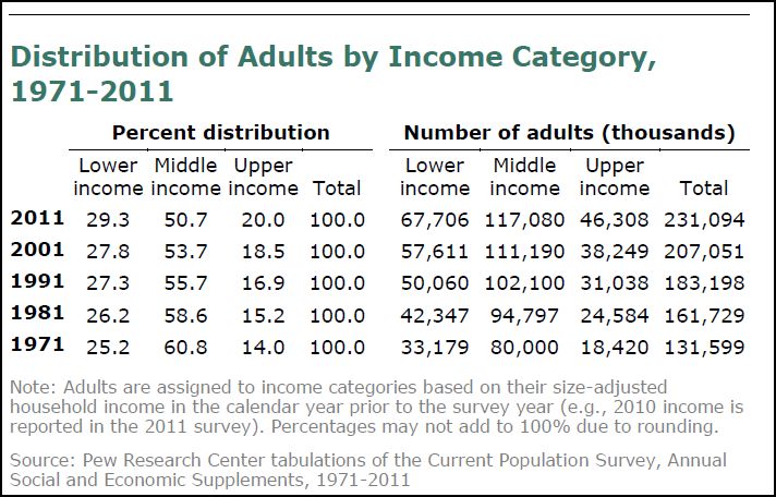
How Many Adults Are Middle Income?” from the full report (p. 65) which discusses the data in the top chart above: 

“The size of the middle-income tier varies over time because the incomes of individual households, in relation to the overall median, vary over time. In 2011, 50.7% of adults (ages 18 and older) lived in middle -income households (see top chart above). In number, that amounted to 117 million adults out of the U.S. household population of 231 million adults. The share of the U.S. adult population that lives in middle-income households has diminished over time. In 1971, 60.8% of adults lived in middle -income households, 10 percentage points more than in 2011 (see top chart). 

The shrinking, or hollowing out, of the middle –income tier has been accompanied by an increase in the shares of the adult population at the high and low ends of the income distribution and roughly equal shares have moved up or down. The share of the population in the upper-income tier has risen from 14% in 1971 to 20% in 2011. At the same time, the share in the lower-income tier grew from 25% in 1971 to 29% in 2011. Thus, from 1971 to 2011, the U.S. adult population has become more economically polarized with relatively more in the top and the bottom tiers, and fewer in the middle. 

The hollowing of the middle -income tier has been a steady and virtually uninterrupted process over the past four decades. Starting from 1970, every decade has ended with a smaller share in the middle -income tier and higher shares in the lower- and upper-income tiers. No single decade stands out as having energized the movement of people out of the middle.” 

MP: Here’s a slightly different interpretation of the changing distribution of income in the U.S. between 1971 and 2011: 

1. In 1971, 86% of adult Americans were considered either lower-income or middle-income, and by 2011 only 80% of Americans were in those two income categories. At the same time, the percentage of “upper-income Americans” increased from 14% to 20%, reflecting significant upward income mobility during those 40 years as millions of Americans left the middle class for the upper-income group.  

2. Between 1971 and 2011, the share of adult Americans in the “middle class” decreased by ten percentage points from 61% to 51%. Of that 10% of American adults who left the middle class, 6% moved up to the “upper-income” category and 4% move down to the “lower-income” category. Alternatively, we could also say that 150 American adults moved up from the middle-class for every 100 adults who moved down from the middle-class between 1971 and 2011. Or we could say that in that 40-year period, it was 50% more likely that an American adult would move up from the middle class to the upper-income group than he or she would move down to the lower-income group. 

3. Using the numbers in the bottom chart we could also say that if the 1971 income distribution percentages (25.2%, 60.8% and 14%) hadn’t changed, then in 2011 there would have only been 32.35 million upper-income American adults (14% of 231.1 million) instead of the actual 46.31 million Americans in that category today (20% of 231.1 million). So instead of characterizing the shifting income trend as the “shrinking, or hollowing out, of the middle –income tier,” we could also characterize it as a period of significant upward mobility, during which an additional 14 million Americans moved into the upper-income tier. 

Of course, we could also say that if the 25.2% of American adults in the low-income group hadn’t increased to 29.3%, we would have about 9.5 million fewer lower-income American adults today. But like I mention above, about 50% more American adults moved up to the highest group than moved down to the lowest group. In other words, Pew’s statement that “roughly equal shares have moved up or down” isn’t really accurate (6% moving up is not roughly equal to 4% moving down). It would be more accurate to say that it was about 50% more likely that an American adult moved up from the middle class to the upper-income group than moved down from the middle class to the low-income group between 1971 and 2011. 

Bottom Line: Far from being gloomy, perhaps there’s a positive story here. A story that over the last forty years there has been significant movement by income category among American adults, as would be expected in a dynamic economy, with movement going in both directions. But on net, the changing income dynamics have been positive overall, with about 150 Americans moving up for every 100 Americans who moved down.

Chicago Fed: Midwest Manufacturing Grew 12.5% Over Last Year, vs. 5.2% for U.S. and 2.2% for GDP; Midwest Auto Output Is Above 2007 Levels

Midwest manufacturing is booming, especially autos.

The Chicago Federal Reserve reported today that its Midwest Manufacturing Index increased 1.8% in July from June to a four-year high, following a revised 0.9% monthly gain in June. On an annual basis, regional manufacturing activity in the 7th Federal Reserve district improved by 12.5% in July from a year earlier, more than twice the annual 5.2% increase in the national manufacturing component of industrial production through July (see chart above).  In comparison, the overall U.S. economy (real GDP) grew by only 2.2% from June 2011 to June 2012. 

Here are some other highlights of manufacturing activity in the 7th Federal Reserve district that covers Illinois, Indiana, Iowa, Michigan, and Wisconsin:

1. Regional machinery output in April gained 11.6% from its year-earlier level, compared to a 6.8% increase in machinery output at the national level. 

2. Regional steel output improved 8.1% from its July 2011 level, compared to a 5.2% increase in national steel output over that period.

3. The Midwest’s automotive output increased by an eye-popping 30% in July from a year ago, compared to a 15.7% gain in national automotive output.  The index reading of 102.6 for Midwest auto sector production in July was the highest level since May 2007 more than five years ago, and brings auto industry production in the Midwest to a level above pre-recession levels of auto production from 2005-2007 when the Midwest automotive index averaged 100.1 (see bottom chart above). 

MP: Midwest manufacturing output growth over the last year (12.5%) continues to lead national manufacturing output growth (5.2%), which continues to lead overall U.S. economic growth measured by real GDP (2.2%).  Today's Chicago Fed report provides further confirmation that U.S. manufacturing, especially factory activity in the Midwest region, remains at the forefront of the economic expansion measured by growth rates in real output.  And the Midwest's automotive sector has made a complete recovery from the 2007-2009 recession with automotive production now at a five-year high and above the pre-recession levels of 2007.  

Bottom Line: If the economy is in recession, or about to enter a recession, it's certainly not being reflected in any downturn in factory activity in America's manufacturing heartland, which is experiencing a manufacturing renaissance and does not appear to be anywhere close to being about to fall off a recessionary cliff.  

Sunday, August 26, 2012

Classic Milton Friedman on Equality vs. Liberty


"You can only aim at equality by giving some people the right to take things from others. What ultimately happens when you aim for equality is that A and B decide what C shall do for D; except that they take a little bit of a commission off on the way."

Intellectual Conformity 1, Intellectual Diversity 0

Harvard Professor Ruth Wisse explains in today's WSJ how intellectual diversity on college campuses has been replaced by intellectual conformism, aka political correctness: 

"The increased political conformism at universities may be traced in part to the redefinition of diversity that accompanied the introduction of group preferences, aka "affirmative action." Schools instituting this policy never acknowledged that it conflicted with competing commitments to equal consideration "irrespective of race, religion, or gender," or that at least half the country questioned its wisdom."

"In part the policy has become a joke, with claimants to 1/32nd Cherokee heritage gaining preferential treatment as minority hires. What is not a joke is that the meaning of "diversity" has shifted from the intellectual to the racial-ethnic sphere, foreclosing discussion of certain subjects like affirmative action, gender differences and everything considered politically incorrect."

"Thus, the current Guide to the First Year at Harvard alerts incoming students to orientation programs in diversity designed to build connections within and across "nationality, race, ethnicity, gender, sexual orientation, class, physical ability, and religion." Characteristically and tellingly absent from the list is political or intellectual diversity."

Update: Excellent comment by J. Storrs Hall, "I have a dream: that a day will come when academics value diversity in the content of our minds, and not the color of our skin...", which was featured here at Maggie's Farm

Energy Updates: Marcellus Shale Gas Production Doubles and the Shale Boom Spreads to Russia

1. The shale gas boom continues in Pennsylvania's Marcellus Shale region, with output doubling this year during the January-June period compared to the same period in 2011, and energy industry jobs in Pennsylvania increasing by 150% from 2009 to 2011.  Here are some details:
Despite low prices and a new tax on the industry, natural gas production in Pennsylvania has doubled in the past year. Drillers operating in Pennsylvania’s expansive Marcellus Shale gas field extracted 895 billion cubic feet of gas during the first six months of 2012, according to figures released by the state Department of Environmental Protection. That’s up from about 435 billion cubic feet during the same period in 2011 (see chart above).

The data are evidence that – despite near record-low prices for natural gas that have caused some companies to slow production and the creation of a new state tax on extracting natural gas – the Marcellus Shale boom is continuing in Pennsylvania.

Patrick Creighton, spokesman for the Marcellus Shale Coalition, an industry group, said the increased drilling was creating jobs, benefiting consumers with lower utility bills and helping the manufacturing sector. “These production reports are proof positive that … Marcellus Shale holds tremendous potential for decades to come,” he said.

The gas drilling industry supports more than 238,000 jobs in Pennsylvania, and has seen job growth jump by 150 percent for the three years ending in 2011. Job growth across all other sectors in the state declined for the same period, according to the state Department of Labor and Industry.
2. The horizontal drilling boom has spread to Russia, where its use is predicted to grow faster than in the United States, and is already driving a boom in shale oil and gas, according to this report in The Moscow Times.  Further, the article also mentions Russia's massive Bazhenov Formation, which could be the world's largest oil shale deposit ("80 times bigger than the Bakken") and is expected to be producing 1 million barrels per day by 2020.  

Peak what?

Cartoon of the Day: Green Jobs

By Lisa Benson.

More than a decade ago, Paul Gigot of the WSJ pointed out that "ethanol is produced by mixing corn with our tax dollars."  In that case, solar energy is produced by mixing sunlight with our tax dollars. 

Saturday, August 25, 2012

One-Year U.S. Stock Market Return = Almost 20%

Top 20 Stock Market Returns Over the Last Year
With all of the bad news coming out of Europe, and the ongoing gloom and doom in America with predictions of a pending double-dip recession, it might be counter-intuitive that some stock markets have actually registered impressive returns over the last year, see the table above of one-year returns based on MSCI data that includes both developed and emerging markets.  Denmark leads the list with a 26.1% return over the last year, and other European stock markets like Belgium (15.8%) and Ireland (13.3%) have achieved returns higher than the world average over the last year of 10%.  Of course one-year returns in markets like Greece (-52%), Portugal (-33%) and Spain (-24%) have been pretty dismal, but it's not like the entire continent is doing that poorly.  

Some of the Asian markets like the Philippines (18%), Thailand (11%) and Korea (9.8%) are doing quite well, and one-year returns in the U.S. of almost 20% (and 15.5% per year over the last two years and 11.4% per year over the last three years) place the U.S. as the No. 3 stock market in the world over the last year for this group.  And the one-year return in the U.S. over the last 12 months of almost 20% is almost three times the 7% average annual return over the last 60 years, and twice the world stock return over the last year of 10%. 

Note: The S&P500 is up by 19.8% over the last year and the NASDAQ has gained 24.4%.  

Update: The chart below shows corporate profits after tax (through Q1) and the S&P 500 Index (through August) over the last ten years (data here).  One of the main drivers of stock prices is corporate profits, and one of the main reasons stocks have gained almost 20% over the last year is probably because corporate profits are at record high levels (at least through Q1).  


Quotation of the Day: Pro-Business vs. Pro-Market

Why do you say that America’s political system is degenerating into crony capitalism?

There is not a well-understood distinction between being pro-business and being pro-market. Businessmen like free markets until they get into a market; once they are in it they want to block entry to others. Pro-marketeers want free markets at all times. The more conservative pro-marketeers are fearful of criticizing business, because they assume they will be seen as criticizing the free market. But we need to stand up and criticize business when business is not helping the cause of free markets.

In what way?

Take lobbying. Lobbying may once have been reactive but now it’s proactive—businessmen use it to shape policy and ask for tax advantages. This is corruptive of democracy.

Examples, please.

Companies with a lot of money abroad sponsored a bill in 2004-2005 that allowed them to repatriate their profits at a low tax rate. Thus $1 produced $220 of tax savings. The Bush-approved drug and Medicare act was a huge bonanza for the drug industry. Their market value increased by several billion dollars when this was announced. I could continue.

~Luigi Zingales, professor of entrepreneurship and finance at the University of Chicago’s Booth School of Business being interviewed in The Economist

Markets in Everything: Private Online DMV in CA

"Cartagz is licensed and bonded with the California Department of Motor Vehicles and we are officially authorized to perform a variety of DMV related transactions. Official CA DMV license stickers and registration cards are issued directly from our central office."

"Each month, thousands of Californians benefit from Cartagz.com’s higher level of customer service and efficiency. As California’s leading vehicle registration service, Cartagz.com helps people save time and avoid trips to the DMV through this unique and easy to use online service." 

Cartagz has experienced phenomenal growth since starting four years ago, with revenues growing from $137,000 in 2008 to more than $14 million last year.  

More Example's (!) of the Misuse of It's for Its

From the Web and the CD comment's section: 

1. Crony Capitalism at it's best! 

2. Hailing from Brooklyn, NY, the band is paving it's own unique path in the world. 

3. Reductio ad Absurdum is a legitimate technique for pushing an argument to it's logical limits and showing it to be absurd. 

4. I'll take the opportunity costs of shale gas over it's subsidized or less environmental alternatives. 

5. And it's sold, for it's "skin rejuvenating properties.” 

6. You actually made a case for it's existence. 

Remember the simple (maybe not) rule: It's is a contraction for "it is."